Scatter plots are effective in communicating data by mapping a feature to spatial dimensions, which we understand intuitively. However, you and I are limited in that we lose the ability to easily and passively comprehend an image past three spatial dimensions. It takes a great deal of thought and even more creativity to push the envelope any further. You can introduce a time dimension us ing animations, but it really doesn't get much better than that.
Real world datasets often have tens of features, if not more. Sparse datasets can have tens of thousands of features. What are your visualization options if when you have a dataset with more than three dimensions?
Parallel Coordinates
Parallel coordinate plots are similar to scatter plots in that each axis maps to the ordered, numeric domain of a feature. But instead of having axes aligned in an orthogonal manner, parallel coordinates get their name due to their their axes being arranged vertically and in parallel. All that is just a fancy way of saying parallel coordinates are a bunch of parallel, labeled, numeric axes.
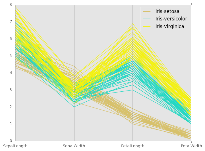
Each graphed observation is plotted as a polyline, a series of connected line segments. The joints of the polyline fall on each axis. Since each axis maps to the domain of a numeric feature, the resulting polyline fully describes the value of each of the observation's features.
Parallel coordinates are a useful charting technique you'll want to add the the exploring section of your course map. They are a higher dimensionality visualization technique because they allow you to easily view observations with more than three dimensions simply by tacking on additional parallel coordinates. However at some point, it becomes hard to comprehend the chart anymore due to the sheer number of axes and also potentially due to the number of observations. If you data has more than 10 features, parallel coordinates might not do it for you.
Parallel coordinates are useful because polylines belonging to similar records tend to cluster together. To graph them with Pandas and MatPlotLib, you have to specify a feature to group by (it can be non-numeric). This results in each distinct value of that feature being assigned a unique color when charted. Here's an example of parallel coordinates using SciKit-Learn's Iris dataset:
from sklearn.datasets import load_iris
from pandas.tools.plotting import parallel_coordinates

import pandas as pd
import matplotlib.pyplot as plt
import matplotlib

# Look pretty...
matplotlib.style.use('ggplot')
# If the above line throws an error, use plt.style.use('ggplot') instead

# Load up SKLearn's Iris Dataset into a Pandas Dataframe
data = load_iris()
df = pd.DataFrame(data.data, columns=data.feature_names)

df['target_names'] = [data.target_names[i] for i in data.target]

# Parallel Coordinates Start Here:
plt.figure()
parallel_coordinates(df, 'target_names')
plt.show()

Pandas' parallel coordinates interface is extremely easy to use, but use it with care. It only supports a single scale for all your axes. If you have some features that are on a small scale and others on a large scale, you'll have to deal with a compressed plot. For now, your only three options are to:
Normalize your features before charting them
Change the scale to a log scale
Or create separate, multiple parallel coordinate charts. Each one only plotting features with similar domains scales plotted
A more handy implementation of parallel coordinates would have separate scale per axis (as is the case with scatter plots), but one can only complain so much for an amazing chart produced by a single line of Python code written by them. If you're interested in a bonus challenge, try extending Pandas' parallel coordinates plotting method to support a separate scale per axis!